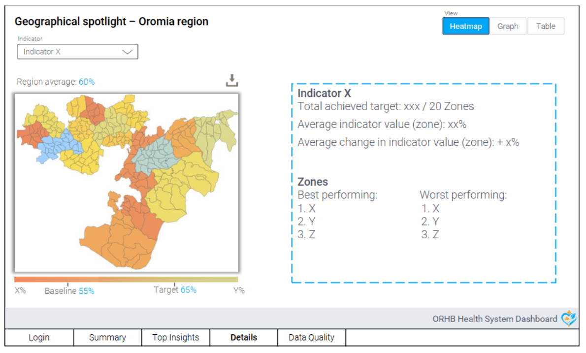
In an era where data drives decisions, data analytics and visualization are crucial in uncovering insights and facilitating understanding. In this post, we delve into the Dashboards built for Oromia Regional Health Bureau (ORHB) in collaboration with the Quantium Health South Africa. The Dashboards were developed using Power BI to illuminate healthcare data for ORHB by shedding light on key trends, performance, challenges, and opportunities in the region’s healthcare landscape.
The journey from raw data to actionable insights involves a series of meticulous steps. The analysis was based mainly on data from DHIS2, one of the most mature data-capturing platforms used throughout Ethiopia. After extracting data from DHIS2, we ingested it into our data warehouse to be accessible and usable for further analytics. Next, the data was seamlessly imported into Power BI. Here, sophisticated data modeling and transformation techniques were employed to refine the dataset, ensuring its readiness for the creation of dynamic and insightful dashboards.
In collaboration with ORHB, our analysis honed in on 10 key indicators selected by regions for their relevance and impact. By aligning our efforts with the priorities outlined by ORHB, we ensured that the analytics dashboard provided data-driven insights that would directly contribute to enhance performance monitoring and address pressing healthcare challenges.
#datavisualization #dataanalytics #datascience #datascientist #dataviz #DHIS2 #HealthcareData #DigitalHealth #HealthIT #DataManagement #MoHEthiopia #Quantium

